Commodities · Updated monthly · Figures to July 2026
What's happening to Commodity prices right now?
One board, 34 world prices, each ranked by its move over the past year: 26 of the 34 prices on it are higher than a year ago, led by tin at +57.6%. Below: the whole table, and the supply squeezes behind the big movers - each from a named source.
Commodity prices are how the world's troubles reach your receipts. A war reroutes ships, a drought thins a harvest, a mine closes - and months later the cost of wiring a house, filling a tank or buying a bag of coffee has quietly moved. Rather than follow those shocks one headline at a time, we keep the whole board: 34 world prices, ranked by how far each one has travelled in a year.
| Rank | Commodity | % |
|---|---|---|
| 1 | Tin | |
| 2 | Silver | |
| 3 | Natural gas (Europe) | |
| 4 | Copper | |
| 5 | Wheat (US) | |
| 6 | Zinc | |
| 7 | Rubber | |
| 8 | Soybean oil | |
| 9 | Gold | |
| 10 | Aluminum | |
| 11 | Rice (Thai) | |
| 12 | Crude oil (Brent) | |
| 13 | Coal (Australian) | |
| 14 | Platinum | |
| 15 | Bananas | |
| 16 | Palm oil | |
| 17 | Cotton | |
| 18 | Soybeans | |
| 19 | Maize | |
| 20 | Nickel | |
| 21 | Coffee (Robusta) | |
| 22 | Coffee (Arabica) | |
| 23 | Potash | |
| 24 | Beef | |
| 25 | DAP fertiliser | |
| 26 | Iron ore | |
| 27 | LNG (Japan) | |
| 28 | Chicken | |
| 29 | Lead | |
| 30 | Sugar (world) | |
| 31 | Natural gas (US) | |
| 32 | Urea fertiliser | |
| 33 | Cocoa | |
| 34 | Oranges |
So, what are we looking at, exactly?
A world price is what the commodity itself costs before it becomes a product - the copper before it's cable, the wheat before it's bread, priced in dollars on the world market. The World Bank has recorded these every month since 1960, one clean number per commodity, and the board above ranks the change in each over the past year. In a calm year the board huddles near zero. Right now the middle of it sits at +12.6%, 26 of the 34 prices on it are higher than a year ago, and the top is a long way above everything else - which is why the sections below take the big movers one at a time.
Why is silver going up?
Silver is +56.0% on a year ago at $58.80 an ounce. The mechanics behind it are unusual: most silver is not mined for its own sake but comes up as a by-product of copper, lead and zinc mines, so when the price rises, miners can't simply dig more of it. The Silver Institute's supply-and-demand figures show demand outrunning that inflexible supply in recent years - and much of the pull is not fear but factories: solar panels use silver paste, and the electronics build-out keeps adding to it.
Why is copper so expensive?
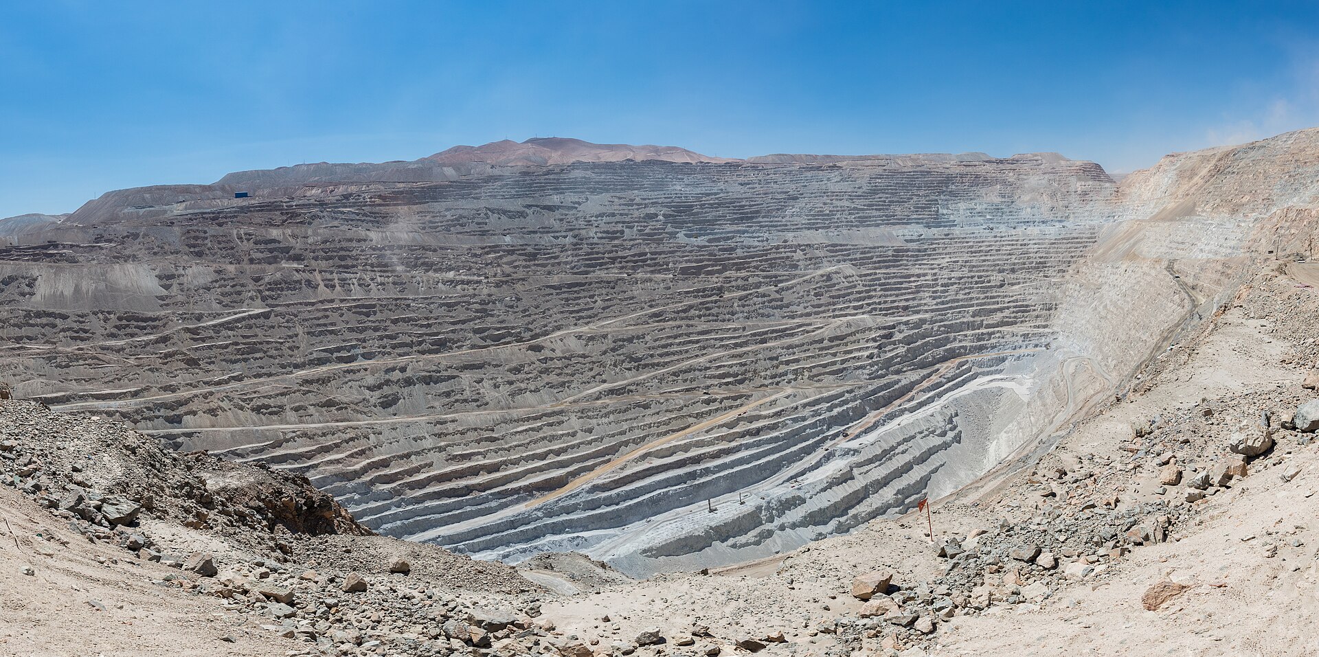
Copper stands at $13,543 a tonne, +38.6% on a year ago. The supply side has disappointed for years: the ore in the great Chilean pits (the photo at the top of this page is one of them) carries less copper per tonne of rock than it used to, and the abrupt 2023 closure of the Cobre Panamá mine removed one of the world's larger sources in a single court ruling. The International Copper Study Group, which counts the world's production and use, tracks the balance - and demand keeps arriving from the other side, because grids, electric cars and data centres are all wired with it.
The same gas, two very different prices
Here's the one the board can't show on a single row. Natural gas in Europe is +55.4% on a year ago at $18.06 per million British thermal units (the standard unit for pricing gas); the same fuel in the US is −9.4% at $2.89. Same molecule, opposite directions. The reason is geography: gas only travels where a pipe or a tanker takes it, so each continent runs its own market. America sits on its own abundant supply, priced locally (the US Energy Information Administration explains the mechanics), while Europe, having largely lost its Russian pipeline supply after 2022, now buys much of its gas as seaborne cargoes in competition with Asia - a market its own energy regulator monitors closely. The chart below is that gap as a single line: how many times the US price Europe pays, month by month.
What Europe pays for natural gas, against the US price for the same fuel
6.2×
Is this geopolitics, weather, or demand?
Usually some of each, and a board like this deserves better than a single villain. Tin, at the very top, is a supply story: a large share of the world's mine supply comes from Myanmar and Indonesia, and the International Tin Association has tracked years of disruption to both - but tin is also solder, and everything electronic needs it. Wheat (+31.9%) is mostly weather: the US Department of Agriculture's wheat research follows harvests tightened by poor growing seasons. And gold (+21.9%) is the purest reading of nerves on the board: the World Gold Council's demand figures show central banks buying at a historic pace, diversifying their reserves. Where a price move has no source willing to put a name to a cause, we say so rather than pick one.
Gold pays no interest and does nothing useful in a vault - its price is close to a running vote on how uneasy the world's reserve managers feel. Read it alongside the board's top, not instead of it.
Price from the board above · demand context from the World Gold CouncilOranges, Cocoa, Urea fertiliser lead the fallers, with oranges down 49% in a year. A pressure board that only ever read "up" would be a poor instrument.
Calculated from the board aboveWhat's getting cheaper, then?
8 of the 34 prices are below where they stood a year ago. The biggest unwind is cocoa (−23.9%): the West African harvest failures that drove chocolate's famous spike have eased, and the International Cocoa Organization's own market reports track the recovery - our food and climate page follows that story in full. Urea fertiliser (−19.4%) is the quiet good news for food prices, and its logic loops back to the gas chart above: urea is made from natural gas, so where gas is cheap, fertiliser follows. Cheaper inputs take months to reach a shelf, but they travel the same road the expensive ones do.
What this board can't tell you
A world price is not your price: what you pay adds freight, taxes, processing and a retailer's margin, and it arrives months later - our grocery page tracks that shelf end. Each row here is one representative grade (Brent for oil, US hard red winter for wheat), so your country's grade can differ. The figures land monthly, so the board is a recent photograph rather than a live feed. And the causes are the hard part: a price can move for three reasons at once, which is why every cause named on this page carries the name of who measured it - and where nobody has, we've left it open.
Further reading
All of our numbers come from live, free sources - here, the World Bank's Commodity Price Data (the "Pink Sheet", published monthly and openly licensed). Every figure on this page is calculated from it, and the page updates when the World Bank does.
If you want to dig deeper: the World Bank's own Commodity Markets Outlook, on the same page as the data, reads the whole board twice a year - and the food end of this story, from cocoa's spike to your own shopping, is on our food and climate and grocery prices pages.